

7 Winning Design Tips and Strategies For App UI/UX Developers
Looking to boost sales in your business? Tried out all strategies you know but still cannot drive the traffic on your app? It’s time to reevaluate your website design and user experience. This is one of the most expository checklists of tips and tricks you can handout to your app developer. We know User Experience Design (or UX Design) is enhancing user satisfaction by escalating the usability, accessibility, and efficiency of user interaction with the website. As a UI & UX designer, your core task is to make a complex SaaS website or AI/ML integrated website easier to understand and user-friendly. There is no absolute prediction on which design trend will work best for your app project. It is an exhaustive list of points that make UI and UX of the website to make it a hit.
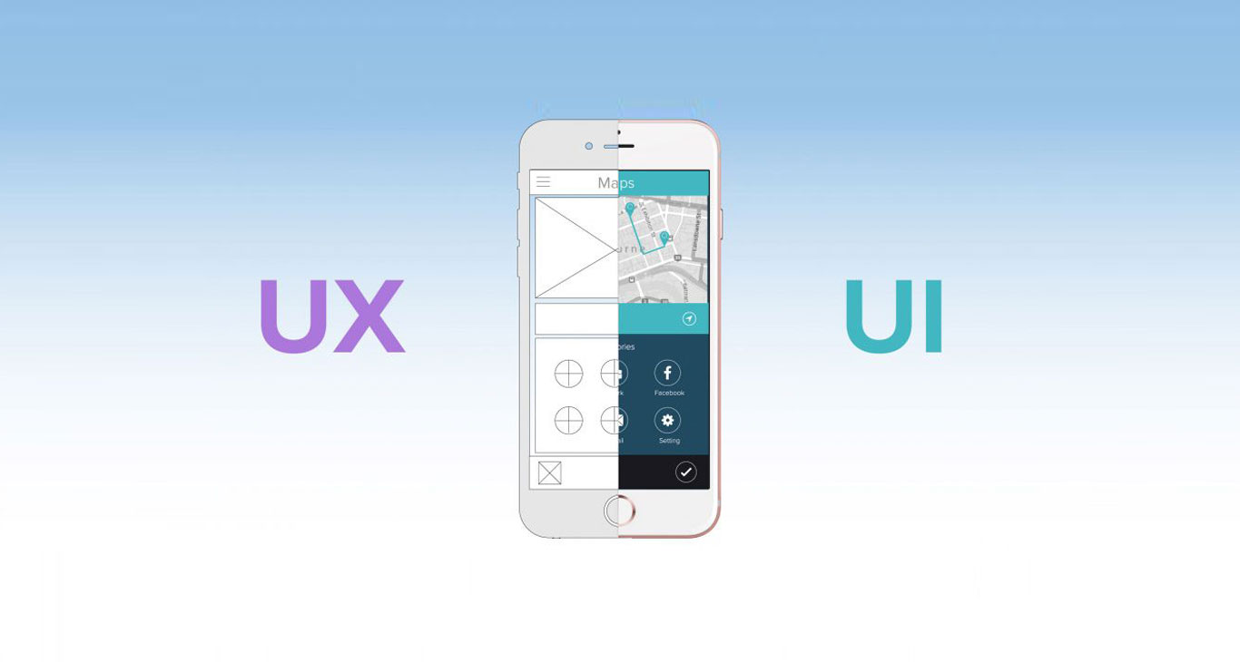
Here we are sharing 7 most probable winning tips and strategies for app UI designers and developers. Since without an excellent user interface, an application just cannot provide better user experience, UI and UX are interwind subjects. Checkout how we at Iqonic Design cater needs of our app designing clients by checking these standards:
1. Content
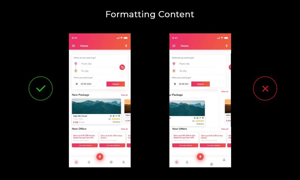
There’s no denying when it is said that content is still the king. However, the significance of content strategy in UI/UX design has started getting momentum recently. When it comes to user-interface (UI design), you can’t impress only with a fabulous design if the content is not impressive or complimenting the design. Similarly, when it comes to UX design, you cannot undermine the power of content strategy. Even if you bring the site to perfection, you’ll absolutely need engaging content in order to engage the user.
Ultimate tip: Always keep your content format in a way that is readable without any efforts to click, scroll or slide. The formating, either horizontally or vertically, should limit to a minimum.
2. Touch gesture
You can enhance your user experience by creating touch gestures or controls. In UI/UX context, these controls can be added to graphical icons and visual representations that display elements and are used to add the input to the website. Here, by elements, we are talking about buttons, icons, lists, etc. By adding touch controls to these buttons and icons is that the user does not have to specifically learn how to work with it. It’s extremely simple.
3. Action buttons
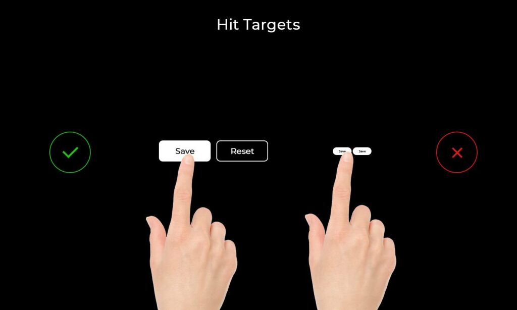
When it comes to interacting with UI elements like buttons, you need your users to get an idea that this button is ‘clickable’. Make buttons look like buttons. When we’re building a call-to-action button, it’s key role is to encourage the action of clicking but when your UI is boring or flat or too small to engage the audience, you subtract the chance of converting your visitors to leads.
4. Spacing and Font size
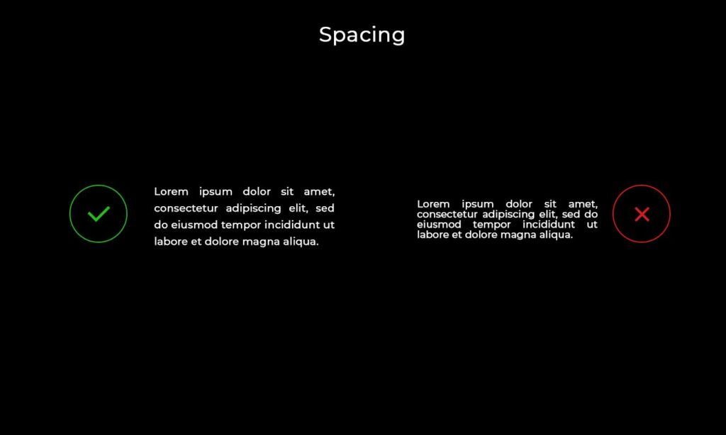
The proliferation of High Definition screens has wreaked absolute havoc on UI/UX designer. Having a great looking design and excellent functioning website is impossible without a well-designed text copy. Spacing and font size plays a major role in highlighting what part of copy should gain more visibility. As an app UI/UX designer, you must certainly know how to strategize your typography. For a great visual hierarchy, you can consider the following six points:
– Text scanning shapes are ‘F’ and ‘Z’. ‘F’ patterns are for text-heavy pages whereas ‘Z’ patterns are for other ads-like pages.
– Bigger text as titles.
– Use blank space around the buttons and other UI elements wisely.
– Bright colors are strong and stand out from the dull and muted colors.
– Text that is arranged on a curve or diagonal stands out against surrounding grid-locked text.
5. Contrast play
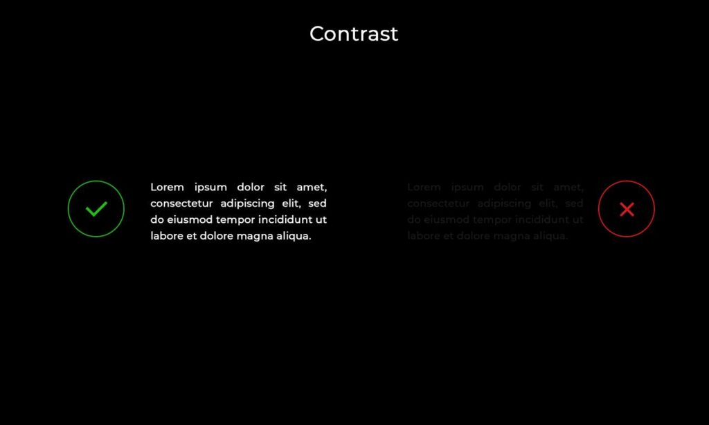
In UI/UX design, the contrast among font, color, and background becomes one of the winning elements. Designing for app-accessibility asks for building an overall experience for all users, regardless of their visual, hearing, motor, or cognitive ability. This is a unified approach where each element – color, font, and background should complement or contrast each other to create a look and feel for the users.
6. No Distorted Images
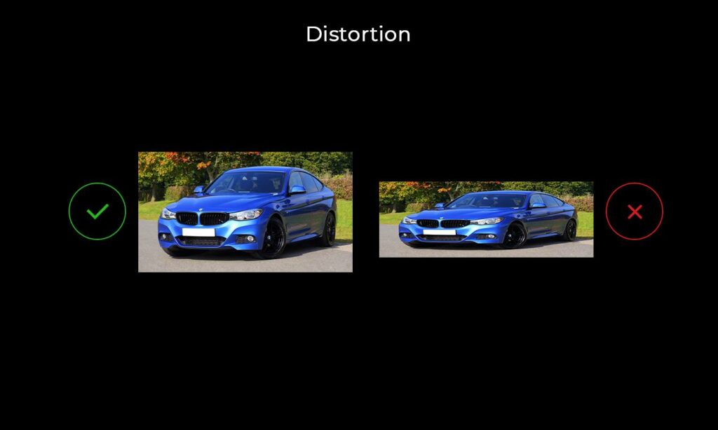
Going with the flow of technology advancement and compatibility browsers. Image size and resolutions play a fundamental role. Use the high resolution when it comes to adding images to your fantastic app project. The basic difference between high resolution and standard is very clear – a standard-resolution display has a 1:1 pixel density (or @1x), where one pixel is one point. High-resolution displays have a higher pixel density, offering a scale factor of @2x or @3x. Most JPEG files you use in your app can be compressed without noticeable degradation of the resulting image.
7. Imagery
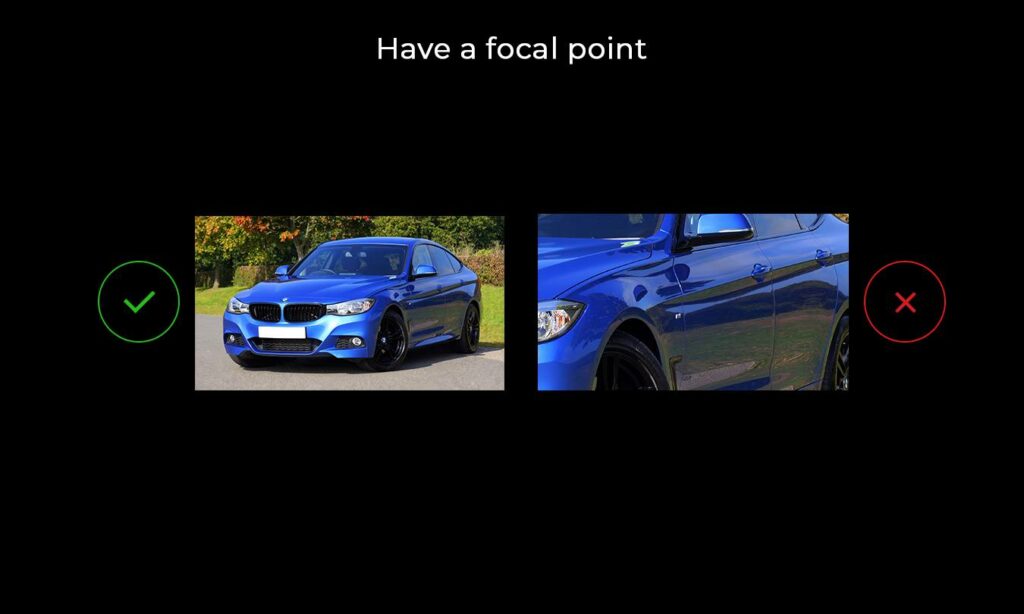
Human brains are accustomed to seeing structure, logic, and patterns. We perceive an image or interaction with any imagery by following theses parameters. The cognitive mind comprehends a certain picture after observing a certain set of elements and the context where they’re used. When it comes to using art in your fantastic app, make sure you’re presenting the image considering the main focal point. If it is about a feature you wish to highlight or if its about the button functionality, you need to set your imagery in the most optimized way.
Here are several Website Design Agencies to look for.
